Advertising
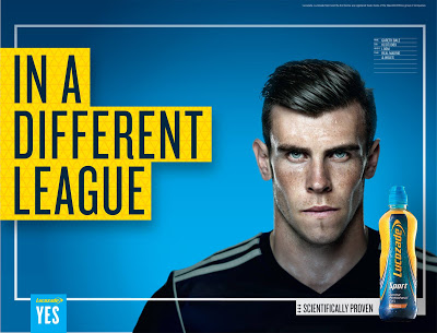
Lucozade is a soft drink manufactured by the Japanese company Suntory and marketed as a range of sports and energy drinks. Created as 'Glucozade' in the UK in 1927 by a pharmacist, William Hunter, it was acquired by the British pharmaceutical company Beecham's in 1938 and sold as an energy for the sick as 'Lucozade'. The company's advertising slogan was 'Lucozade aids recovery'. It was rebranded as a 'pick me up' in 1978 and as a sports drink in 1983 to associate it with health rather than sickness. Originally, the target audience of the sports drink was for the 'sick', however, 'Lucozade Energy' has always seemed a brand obsessed with physicality. The latest push towards men aged between 18 and 30, as the brand bids to widen its audiences beyond the sports performance market. The campaign launches with the ambassador Gareth Bale a hot topic in the sports world currently, which would plea an interest to its audience (18-30). Furthermore, the print adverts language choice has been selected carefully, 'In a Different League'. This would suggest a play on words, also know as a pun, to be 'in a different league' could be making references to football or could be promoting the product itself. Along side this, the statements 'scientifically proven' and 'yes' provide both a positive affirmative and allow for an ambiguous statement. In addition to this, the colour scheme represents the colours of the bottle, while Gareth Bale is seen to be almost 'dulled down'. This allows for the colours to be highlighted and making the print advert memorable. Finally, the representations which are evident within the advert include the following: masculinity, male, white, famous and popularity.

Old Spice is an American brand of male grooming products encompassing deodorants and antiperspirants, shampoos, body washes, and soaps. It is manufactured by Procter and Gamble. Originally launched as 'Early American Old Spice' by William Lightfoot Schultz's soap and toiletries company, Shulton inc in 1937, it was first targeted at women, with the men's product only being released before christmas at the end of the year. Over time as the men's products found more success it began to focus exclusively on those. There seems to be an informality with the language and theme, which is shown through evident representing like the white, stallion horse, palm trees, casually dropped sweater, intense facial expressions and finally the proust itself.

Shelter is a registered charity that campaigns to end homelessness and bad housing in England and Scotland. It gives advice, information and advocacy to people in need, and tackles the root causes of bad housing by lobbying government and local authorities for new laws and policies to improve the lives of homeless and badly housed people. The advert itself is a poster print advert that has neutral representations within it. This could be suggesting that these types of problems these people face can happen to any of us. The close on each advert also adds to this and emphasises their venerability. In addition, the colour scheme which has been selected (red, white and back) creates a simplistic look to the advert, however, the colors red and black could imply danger and death, which in the worst cases might be what some homeless people face. Finally, the print poster also uses also uses emotive language so we as the audience can sympathise and donate money to the charity.


Comments
Post a Comment