The Big Issue- Cover Analysis
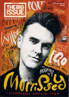
 This 2017 cover of The Big Issue focuses on the successful music legend Liam Gallagher; to date, he is one of the biggest and most influential names in the music industry. The positioning of Liam Gallagher is centered in the middle of the page to draw attention to his complexion and pink jacket, highlighting that this magazine doesn't follow the typical representations in the media currently. The simplicity within the layout of the cover also highlights the minimal approach the editor wants to present to the reader, which further adds to the ease of understanding and a more aesthetically pleasing for the spacing gives it a clean and professional finish. This adds to the attraction of the magazine and will aid their sales. The minimal layering on the page identifies the minimalism in the magazine, appealing to target audience, smart and professionalism. As the mid to close up shot of Gallagher is positioned next to the masthead, which would suggest that we don't need to draw our to the masthead because of its establishment. This is also makes the image stand out and gives the cover great dimensions as the other cover lines are placed over the top of Liam Gallagher. Some may describe the cover to be somewhat relaxed and not too distracting.
On this particular front cover of The Big Issue magazine we assume that the target audience is one of a younger generation. This is because the main feature is focused on the recent release of the updated take on the Disney film 'Beauty and the Beast'. The colours featured on the front cover are monochromatic with an element of they eye-catching yellow on the dress, this could be an approach used by The Big Issue so that the audiences attention is captured immediately and encourages people to buy the magazine.In addition to this, the sparkles placed around the 'Beauty and Beast' also adds to the idea that this particular editions targeted at the younger generation. Again, The masthead is positioned in the right hand corner smaller than the standard masthead of other conventions, implying its well-established name.


Comments
Post a Comment